01 / the opportunity
Design systems keep the values. They lose the reasons.
the problem
I've led design systems for years, and the same thing keeps happening. Teams copy a system made for someone else's product. The values come along and the decisions behind them don't. When the product changes, nobody knows what to change, so the system drifts or gets rebuilt.
the gap
Tokens are everywhere already: Figma variables, token tools, design system docs. But a token is only shorthand for a decision. Nobody shows which question it answers, or why. You can write the shorthand from the decision, but you can't recover the decision from the shorthand. The opportunity is to keep the decisions.
why it's worth building
- Why now: agents write a lot of UI. Without the reasons, an agent guesses: a new grey here, a second primary button there.
- The questions are finite: products differ, but the questions a design system has to answer repeat. That makes any two systems comparable.
- Distribution is solved: shadcn showed that people want UI as code they own. A whole system can arrive the same way.
- The bet: if the reasons ship as data with the system, people and agents can both change it without guessing.
the vision
A shared grammar that design system people argue over and improve. The questions and answers on the site are a starting point, not a standard. Anyone can change an answer in their own scheme, or propose a better question.
02 / product decisions
Product decisions that shaped Open DS.
-
the grammar
Ask about the decision, never about a component.
My first screen asked a question about a table, and I rejected it. A table isn't a decision. How text is set in it is. So the questions are about the decisions a system makes, in type, color, spacing and the rest, and each area answers the same five: roles, how many, how defined, values, and where it lands. Components are known patterns that receive the answers.
- trade-off
- A team can't answer a question about one component directly. Component keys cover this: one key per element, variant and state, shared by every scheme, so a component's look still traces back to a decision.
- payoff
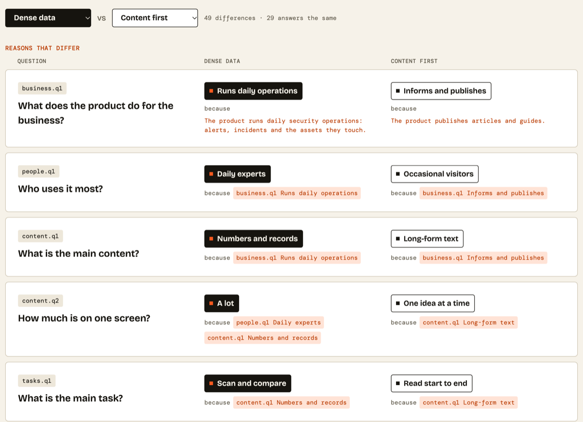
- The grammar stays finite, and schemes can be compared. Dense data and Content first answer the same 78 questions and differ on 49 of them, and each difference shows its reason.
-
the product
Make the decisions the product.
An early Button page opened with a big table of keys, tokens and values. It looked like every other design system, and it hid the part that's new. So I changed the order on every screen: the question, the answer, the because, the effect on a live component. Tokens come last, as the shorthand for what was decided.
- trade-off
- Someone who only wants a value takes an extra step. The tokens stay one click away, always linked to their decision, and agents can go straight to a key with get_key.
- payoff
- Every value can be followed to a decision, and every decision to a reason. Ask why Dense data's line heights sit on the grid, and the chain runs through scanning rows, numbers and records, and a product that runs daily operations.
-
the journey
Start from a ready-made scheme.
The obvious choice was to start by answering questions: describe your product and get a system back. I think the reverse order has priority. You pick a scheme close to your product and deploy it, and the questions are there to read, and to change where your product differs.
- trade-off
- A scheme is written for a typical product, not yours, so some answers will be wrong for you. Each scheme says when to use it and when not to, and What moves shows what a change would touch before you make it.
- payoff
- You have a working system in one command. You only spend time on the decisions that make your product different.
-
delivery
One engine, two ways in.
People deploy with a CLI and agents deploy through MCP. I didn't want two implementations drifting apart. So there's one engine in the open-ds package, and the CLI, the MCP server and the site all use it. When an AI deploys a scheme, it runs the same command a person would.
- trade-off
- The MCP server never writes to your disk. Its plan tools return commands for the agent to run, so the agent has one more step. Anyone without a beta key can run the same server locally.
- payoff
- Both paths give you the same design system, and the agent also gets tools a person doesn't need, like why and when_to_use. Designers get each scheme as a Figma kit, generated from the same data.
03 / how it works
From a reason to a design system, one decision at a time.
Reasons come first and decisions follow. Tokens are the shorthand that carries those decisions through the whole design system, so one scheme renders the works: Storybook, docs, Style Dictionary tokens, fully working components, a CLI and an MCP server.
-
01 / reasons
Who is it for?
Daily experts, scanning records.
-
02 / decisions
What follows?
Line heights stay on the grid.
-
03 / tokens
Shorthand for decisions
Each token maps back to its decision.
-
04 / design system
Code you own
Storybook, docs, Style Dictionary, working components, CLI, MCP: the works.
7 mcp tools
- list_schemes
- get_answer
- why
- when_to_use
- compare_schemes
- what_moves
- plan_init
dense data / selected fields
A decision
typography.definition
{
  "question": "typography.definition",
  "option": "ratio-grid",
  "why": "Lines stay on the grid so rows
    align, and grow with the user's
    text size.",
  "because": ["tasks.q1", "people.q2"]
}
The decision it follows
tasks.q1
{
  "question": "tasks.q1",
  "option": "compare",
  "why": "People scan rows and
    compare values.",
  "because": ["content.q1"]
}
The same chain from the CLI
npx open-ds why
$ npx open-ds why dense-data
    typography.definition

How are sizes and line heights
defined? A ratio, line heights
on the grid.
  because: Scan and compare.
because: Numbers and records.04 / design & interface
A design system that has to show its own thinking.
The product's one action is to pick one, so the brand is one lit cell: cream, ink and one orange, with Bricolage Grotesque and DM Mono.
process
-
01 grammar
Reasons first, then the decisions that follow. Every question has a stable id.
-
02 mind map
I curated the questions and answers in FigJam, with each scheme's choices side by side.
-
03 one scheme, end to end
Dense data in Figma first: every decision, components, light and dark.
-
04 the flow
Home, schemes, compare, what moves, install and contribute, questions first on each.
journeys
maker
- pick a scheme
- npx open-ds init
- build
- change what differs
agent
- connect MCP
- get the scheme
- run the plan
- ask why
designer
- pick a scheme
- open the Figma kit
- read the answers
- use the components
-

brand palette
One lit cell.
Picking is the product's one action, so one orange marks what matters, and cream and ink stay quiet around it.
-
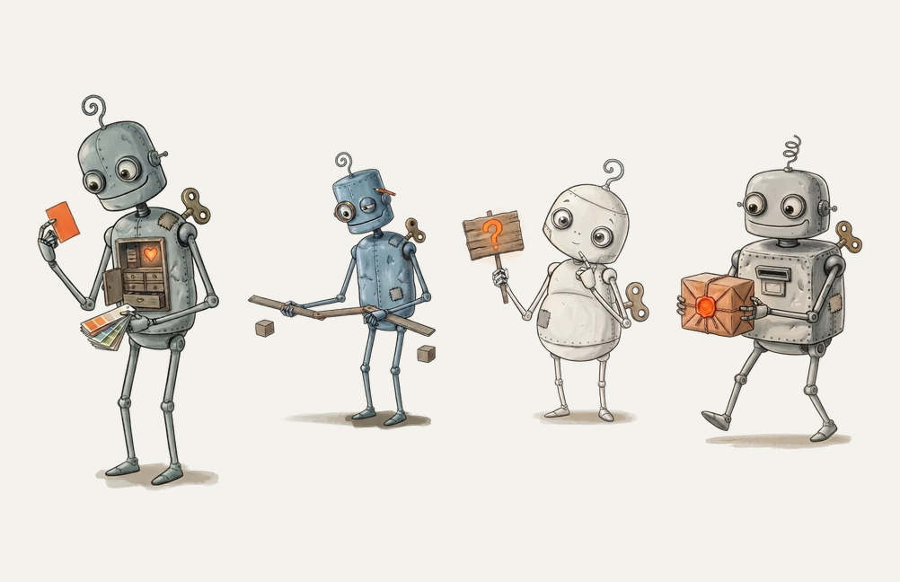
robots
A dense reference tool can still feel warm.
Questions and ids read like a database on their own. One robot per page adds warmth, each doing that page's job: sorting swatches, asking questions, carrying the parcel.
-
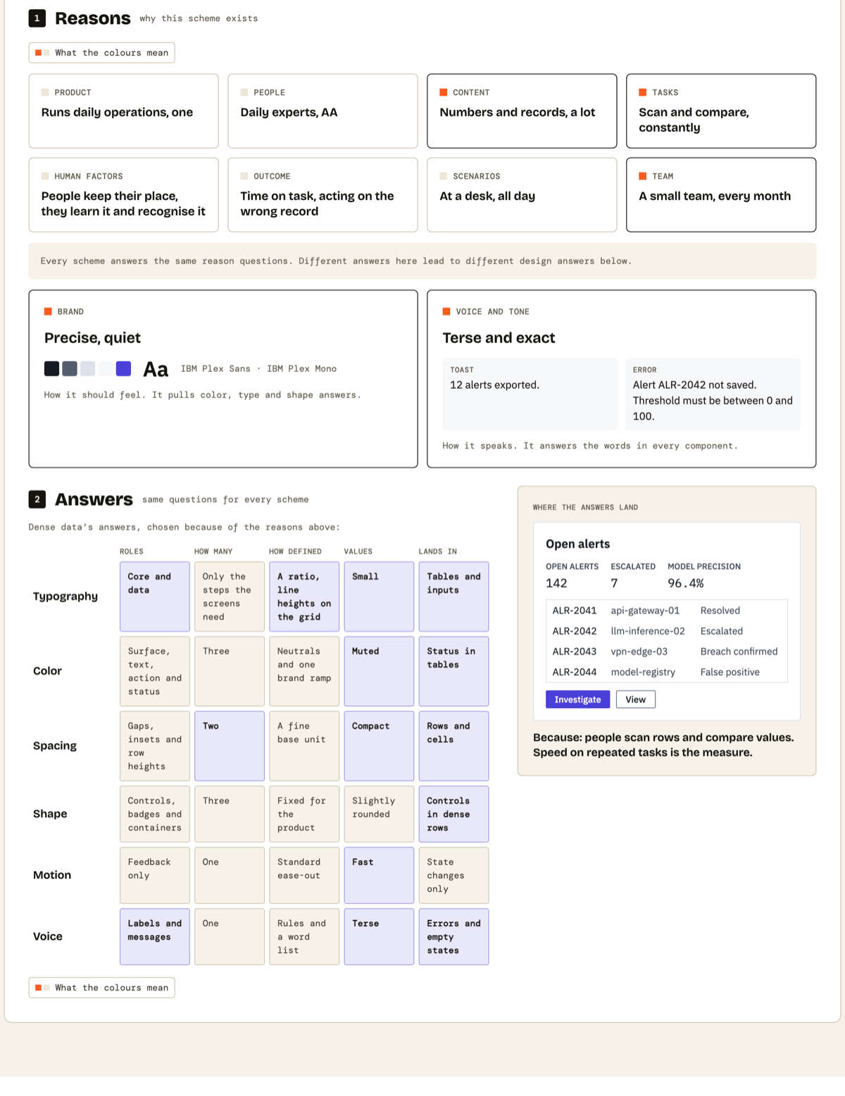
homepage card
Put the reasons above the answers.
Most design system sites open with components. I put the reasons first, with brand and voice beside them, so the answers below read as results. Orange marks the few reasons that weigh most for this scheme, and lilac marks answers only this scheme gives. Everything else stays quiet.
The grid shows the answer in words, not values, because a number means nothing without its reason. And each scheme fills the screen with its own scenario and data. A shared sample table would hide the very differences the card is there to show.
-
compare
Show only what differs, and keep the why next to it.
A side-by-side of two design systems is usually a wall of values. I cut it to the questions where the schemes disagree, and reduced the rest to a count: 49 differences, 29 the same. The tokens are off this page entirely.
Every row keeps the same three columns, so your eye runs straight across: question, one answer, the other. The answers are the heaviest thing on the page, and the because sits right under each one in a quieter mono, so you can scan the choices first and read the reasons when you care.
-
what moves
Show the change on real components, not in a list of tokens.
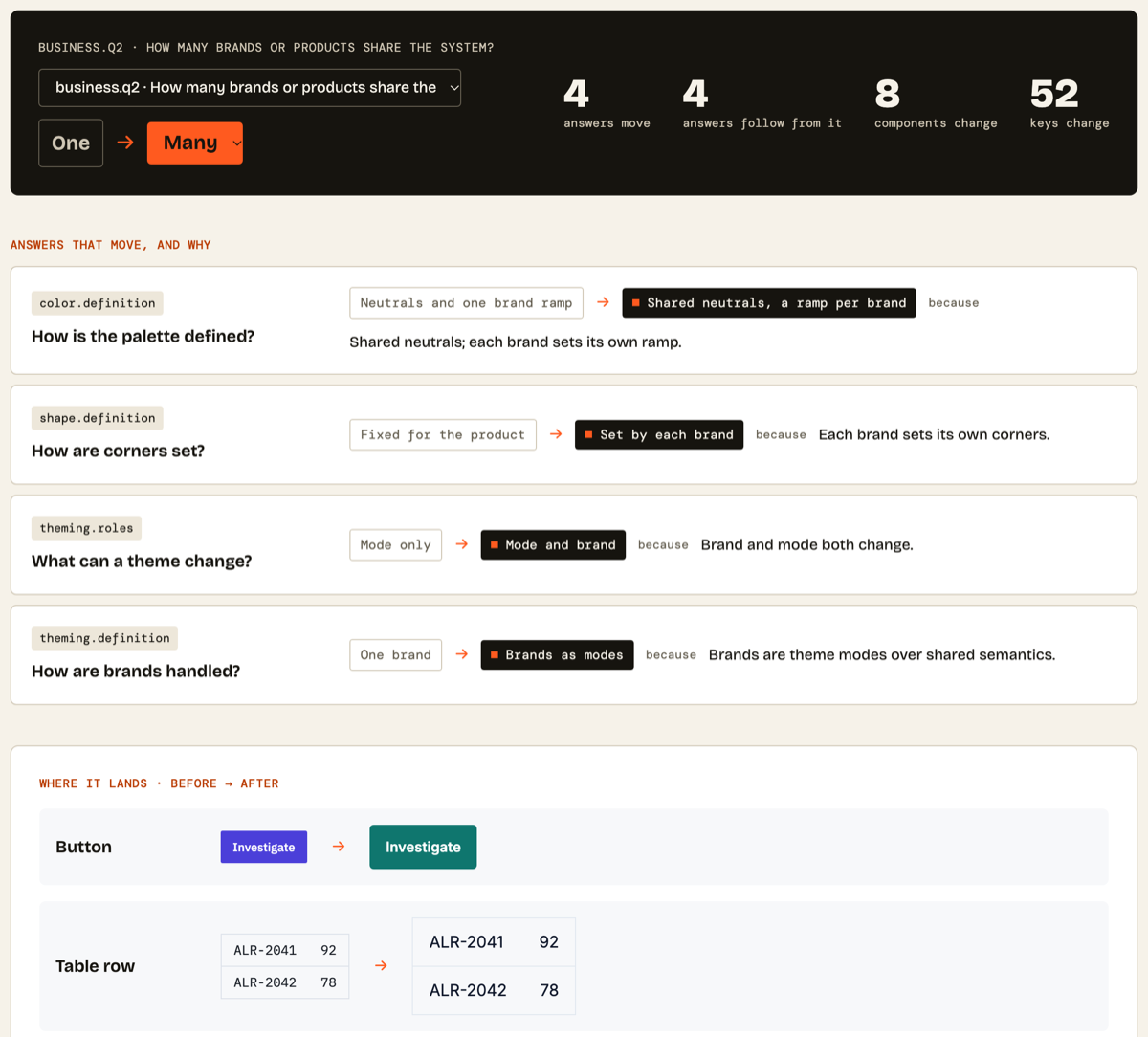
Changing an answer is the riskiest moment in a design system, so this page puts one dark band at the top with the one control and the size of the change. Orange marks only your new pick, and the old answer stays outlined, so the from and to read at a glance.
Below it, I show a real button and table row, before and after, because people judge a change by looking at it. The after comes from the closest scheme that already answers that way, and the page says so. I chose that over faking a preview: the site only shows things that are true.
figma kits
The same decisions, in the tool designers already use.
Every scheme also ships as a Figma kit, generated from the scheme itself. That's five kits, one per scheme. A designer gets the decisions the code gets, with the questions and reasons still attached. Each kit holds 158 variables and all 78 answered questions.
-
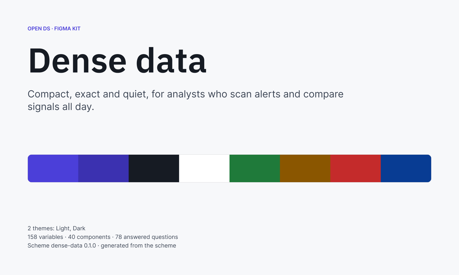 Dense data
40 components, 2 themes
-
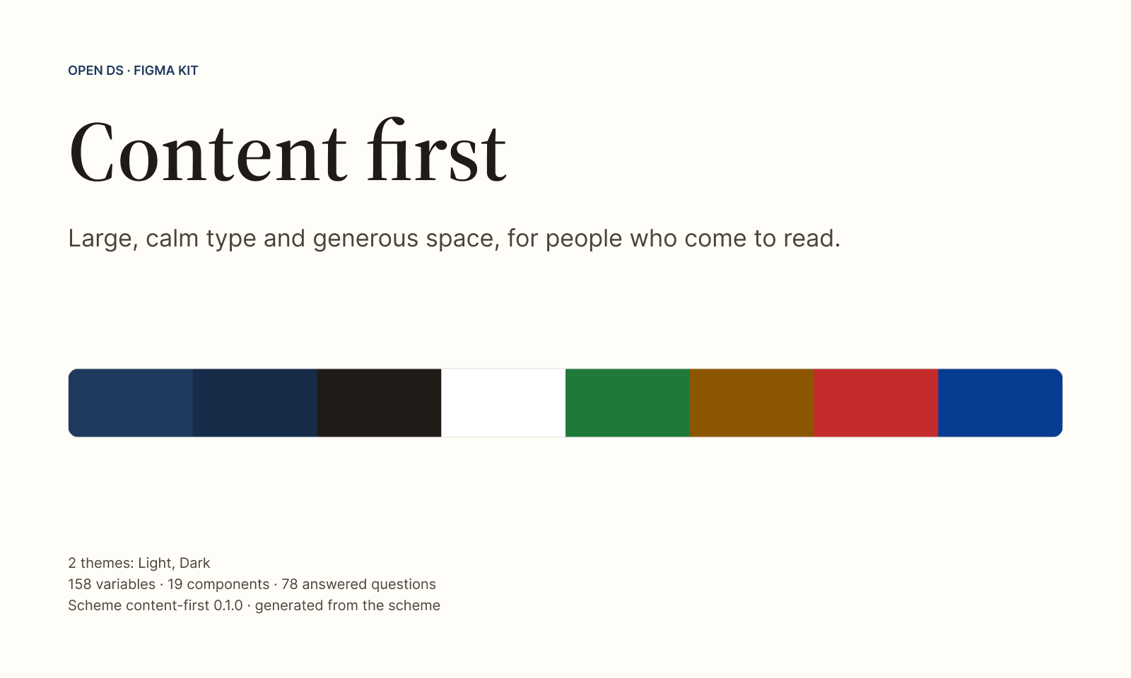 Content first
19 components, 2 themes
-
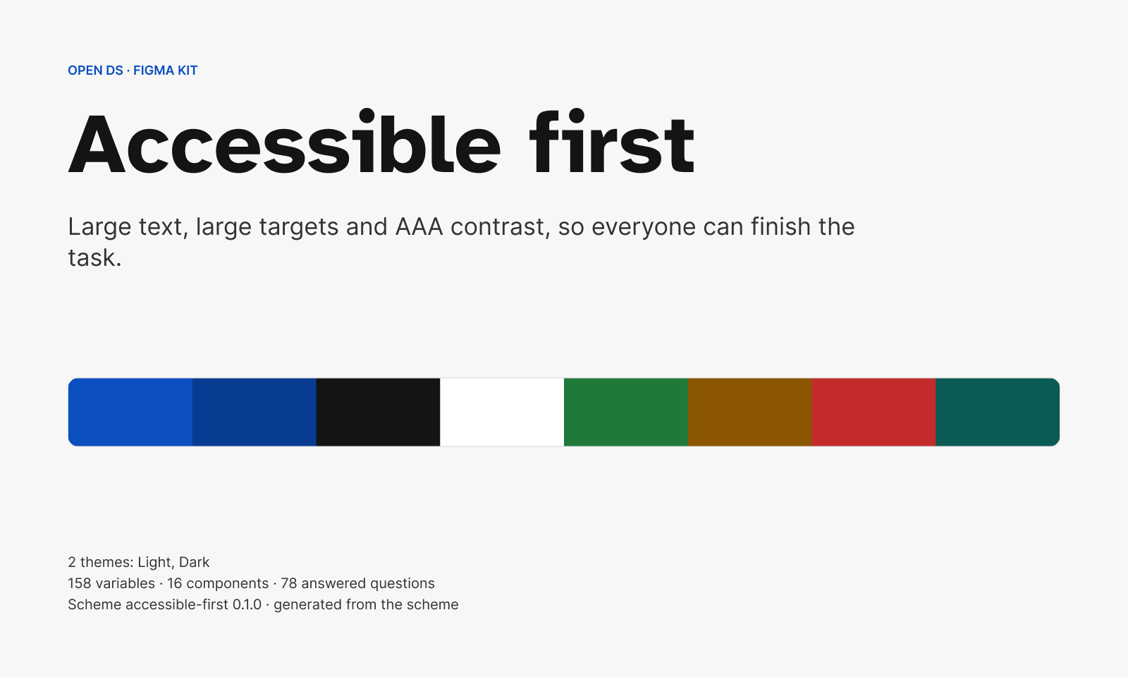 Accessible first
16 components, 2 themes
-
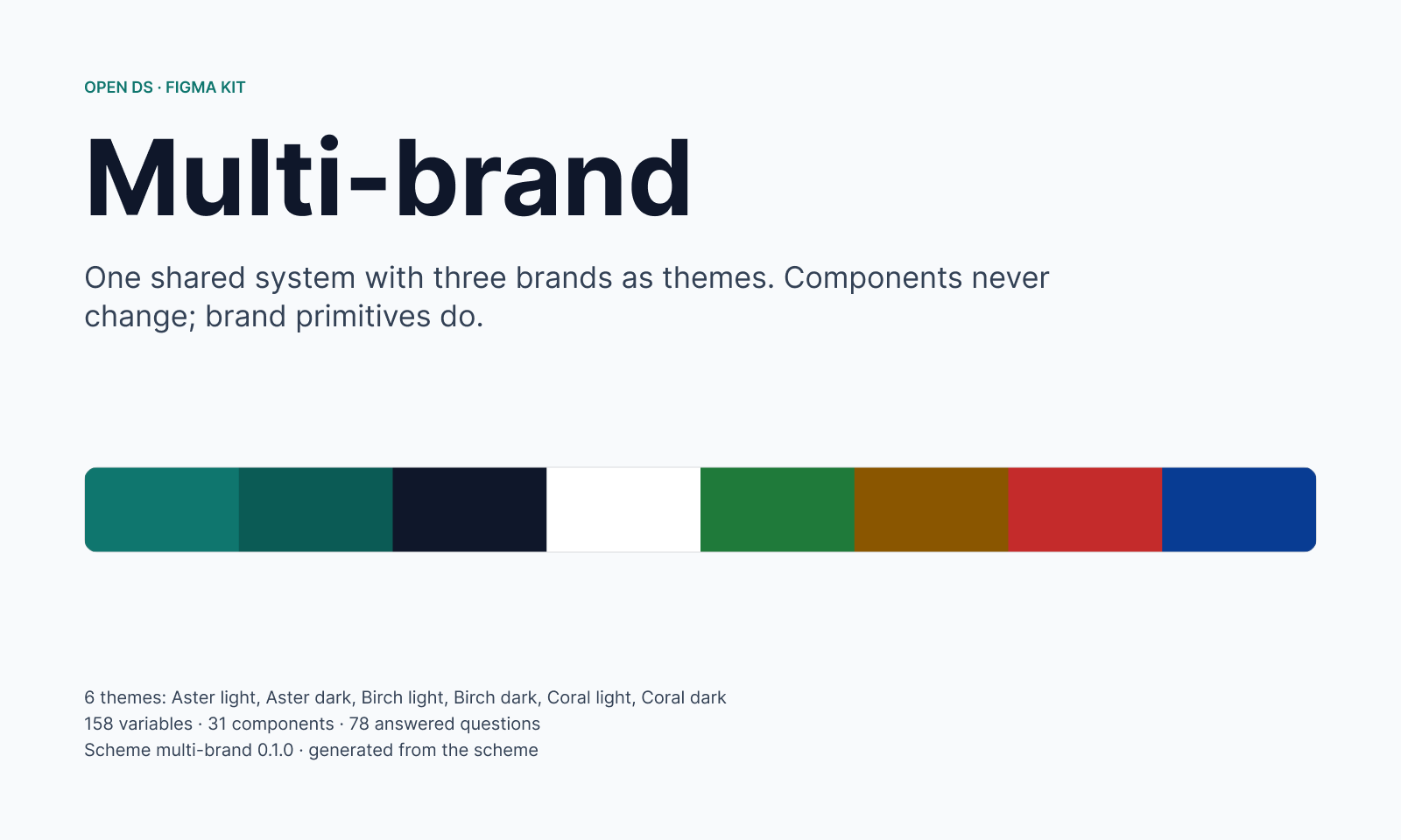 Multi-brand
31 components, 6 themes across 3 brands
-
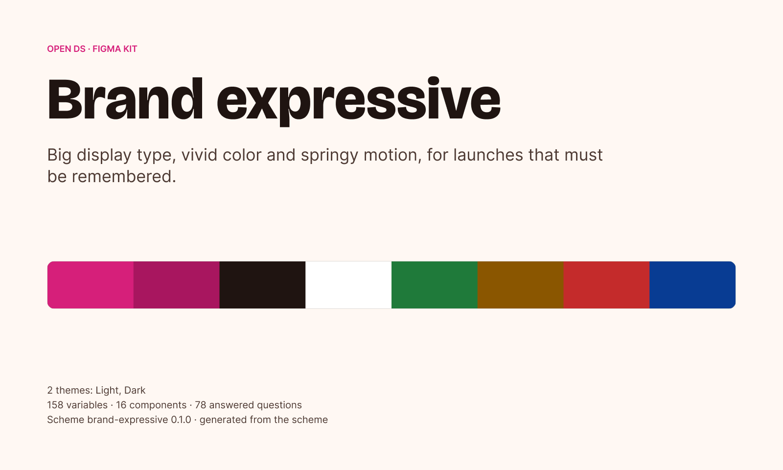 Brand expressive
16 components, 2 themes
what's in a kit
-
The answers
A page with every question and answer, so the reasons travel with the file.
-
Variables
The shorthand for each decision, in every theme.
-
Styles
Text and effect styles, with the foundations laid out.
-
Components
The components that have component keys, built on those variables.
- trade-off
- A kit is a file you copy, not a library you subscribe to. A rebuild recreates everything, which would break links in files that use it, so a shared library waits until rebuilds can update in place.
- payoff
- Five kits and the code come from one source, so design and code can't disagree about what was decided.
05 / outcome & next steps
Designed, built and published Open DS.
A live site, a published npm package, an MCP server and a Figma kit for every scheme, with five schemes you can deploy today. The next step is seeing how real teams use and change them.
built platform
Website, CLI on npm, Figma kits, hosted MCP server in beta, and the same server to run locally.
tech stack
Node CLI and MCP engine; Style Dictionary and DTCG tokens; components on shadcn and Radix; Storybook; a Next.js site.
- Schemes: Dense data, Content first, Accessible first, Multi-brand and Brand expressive
- 5
- Questions every scheme answers, 18 about reasons and 60 about scopes
- 78
- Figma kits, one per scheme: variables for every theme, styles, components, and every question and answer
- 5
What comes next
Today a scheme's tokens are written with the scheme, so changing an answer in your own copy doesn't rebuild them yet. Next is composing schemes from their parts, so a decision flows through to its shorthand, and a clear way to edit a scheme. I also want more people to challenge the questions.